Color systems and accessibility - an adventure in plugin authoring for Chakra UI and Tailwind
An adventure in plugin authoring for Chakra UI and Tailwind. With some accessible color systems mixed in.

I’m a tab hoarder. I have 30+ open in my browser(s) at any given time, and I’m using four devices (yes, that’s 30+ times 4). Aside from the fact that it makes me feel something like this, it has an unexpected upside - especially on mobile devices. Once you press that tab button that allows you to see all your garbage tabs, you can get an overview of all those things that captured your attention for one reason or another. The benefit of that overview is coming up with some exciting and unexpected connections. You could ascribe any semblance of creativity I have to that process - be chaotic, find links in said chaos, and try building something useful out of it.
This brings me to today’s topic - plugins for CSS macro systems and UI libraries. They are seemingly unrelated and yet share a lot. For a while, probably longer than a few months, I had three tabs open in my phone’s browser for entirely unrelated reasons:
- https://reasonable.work/colors/
- https://tailwindcss.com/docs/plugins
- https://chakra-ui.com/docs/styled-system/customize-theme
I had some previous experience customizing color themes for Tailwind, as I used reasonable colors there for a project in which accessibility was essential. The logic behind that decision was quite simple. Not that Tailwind’s default color scheme is terrible or inaccessible, but Reasonable is simpler and leaves me much less room to screw up. Finding myself needing to do the same config again for a different project, the idea of packaging it as a plugin struck me. Plus, it was October, and Hacktoberfest was going strong - the perfect time to publish something and share it with the community.
Reasonable colors to JSON
Step 0 was easy - I already had a tailwind color config handy from my previous projects. I also did some digging in the reasonable colors repo to maybe find any “prior art” to help along. Alternatively, join such an effort to create a reasonable colors plugin if there is one. There was an effort before (https://github.com/matthewhowell/reasonable-colors/pull/7), not as a plugin but as a color config. So, the first round of credits goes to https://github.com/philippreiner. I left a comment in that PR thread and went along to build the plugin.
Reasonable colors x Tailwind
I started digging through the docs on what’s Tailwind’s definition of a “plugin.”
From Tailwind’s docs:
Plugins let you register new styles for Tailwind to inject into the user’s stylesheet using JavaScript instead of CSS.
Well, d’oh. It’s a CSS macro system; of course, we’d be registering new styles. As simple as that sounds, I had to go through several trial and error loops, trying to understand the best way to enhance or override the existing colors. There are plenty of functions and ways to add to the styles, but none seemed to fit the bill for what I was after. What I needed was the following:
- Expand the theme with a bunch of colors
- Take into consideration the potential clashes that might happen
- Offer options for said clashes (enhance or override)
- Export all of that as simply as possible. Simple = easy to maintain.
After a few more rounds of failing with static utilities and base styles, I noticed this:
Utility plugins can provide default values by including a configuration object as the second argument to the plugin function
Okay, that sounds like a static object, precisely what I was after. In theory, I could get away with an empty function as a first argument to the plugin function and the JSON config as a second. I could also export two plugin functions that override or enhance the existing tailwind color palette.
The plugin conceptually ended up looking like this:
const plugin = require('tailwindcss/plugin');

// Giant color config object
const colorConfig = {
  gray: {
   100: '#f6f6f6',
   200: '#e2e2e2',
   300: '#8b8b8be,
   400: '#6f6f6f',
   500: '#3e3e3e',
   600: '#222222',
  },
  // ...the rest of the color definitions...
};

// Override tailwind's colors
const override = plugin(function () {
  // empty function as a first arg
}, {
  theme: {
    colors: colorConfig
  },
});

const renamed = {};

Object.keys(colorConfig).forEach((k) => {
  renamed[`r${k}`] = colorConfig[k];
});

/** Enhance them instead - so you can still use the whole range of
* tailwind's palette while reasonable gets "namespaced." In practical terms,
* using pink-100 from Tailwind remains pink-100, and its reasonable colors counterpart
* becomes rpink-100. No clashes; they can coexist that way.
*/
const enhance = plugin(function () {
  // empty function as a first arg
}, {
  theme: {
    extend: {
      colors: renamed,
    }
  }
});

module.exports = {
  override,
  enhance,
};
Complete source published at: https://github.com/DBozhinovski/tailwind-reasonable-colors. Drop it a ⭐ if you find it useful 😊
Reasonable colors x ChakraUI
On to ChakraUI. I wanted to dig deeper into the styling system it uses, mainly because it makes for a consistent overall look and feel. Moreover, it does it in a very reasonable (no pun intended) and visually appealing way.
The first stop, again, is the docs. Particularly this page. Styling systems would be a very different beast than UI libraries, but as it turns out, what I was after boiled down to a single function: extendTheme. I wasn’t going to customize any components or anything more in-depth, just the color system.
A brief intermission for the second round of credits: https://twitter.com/NikolovLazar helped me along with some examples from his great prose plugin.
What I ended up with looks something like this:
import { extendTheme } from "@chakra-ui/react";

const colorConfig = {
  gray: {
    100: "#f6f6f6",
    200: "#e2e2e2",
    300: "#8b8b8b",
    400: "#6f6f6f",
    500: "#3e3e3e",
    600: "#222222",
  },
  // ...the rest of the color definitions...
};

// Override ChakraUI's colors
export const reasonableColorsThemeOverride = extendTheme({
  colors: {
    ...colorConfig,
  },
});

const renamed: { [key: string]: { [key: number]: string } } = {};

Object.keys(colorConfig).forEach((k) => {
  renamed[`r${k}`] = colorConfig[k];
});

/** Enhance them instead - so you can still use the whole range of
 * ChakraUI's palette, while reasonable, gets "namespaced." In practical terms,
 * using pink-100 from ChakraUI remains pink-100, and its reasonable colors counterpart
 * becomes rpink-100. No clashes; they can coexist that way.
 */
export const reasonableColorsThemeEnhance = extendTheme({
  colors: {
    ...renamed,
  },
});
Complete source published at https://github.com/DBozhinovski/chakra-ui-reasonable-colors. Again, any ⭐ appreciated 😊
Color range and variations
Once I published the plugins, I had some constructive discussions about the packages. One such (and the third round of credits) was with https://twitter.com/_isBatak :
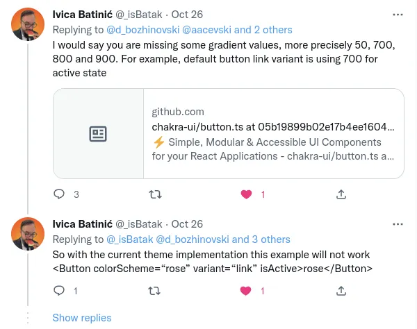
He was right, of course. However, reasonable comes with a reduced set on purpose. Luckily https://twitter.com/_isBatak offered a solution, also linked in that thread: https://color-scheme-builder.vercel.app . Color scheme builder is an excellent tool for generating additional color variations from a set of given colors. It supports all of the commonly used distribution functions. A couple of git pushes and an npm publish later, both plugins got a complete set of colors. I used the linear distribution function since it made the most sense for reasonable colors. Now, both plugins come with four extension options:
override- overrides the color on color clash (original reasonable colors only)enhance- enhances the existing palette by namespacing the color (original reasonable colors only)overrideFull- overrides the color on color clash (original reasonable colors plus generated variations)enhanceFull- enhances the existing palette by namespacing the color (original reasonable colors plus generated variations)
Using the last two, you avoid any potential color weirdness from anything that has to do with color while benefiting from an accessible palette.
In closing
Have a look at those open tabs. Yeah, the ones that are further to the left (or to the top if you’re reading on the phone). They are probably there for a reason. Use them as inspiration, and use this article as your sign to build and publish something. You just might solve someone’s problem and learn something cool along the way 🍻
Stay in the loop
New articles, talks, and the occasional deep cut — straight to your inbox.


